Monday, January 31, 2011

Light box

First project of the semester! -- Make a 12x12x18" box with one open panel that is white on the inside.  Then figure out how to manipulate light so that it divides the box into four spaces.

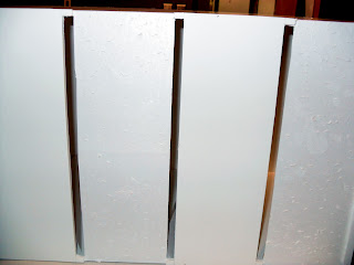
I used foam board in order to make my box, and the first thing I could think of is How could I manipulate foam board in order to create a light effect?  My first idea was to carve out the foam board so that there was only a really thin layer left.  The plan was to have the box look like nothing was done to it on the inside, but then when light was shun on it, it would have a pretty light effect.  I carved 4 sides of the box so that there was a sense of fourness on each side.


I realized I had to use natural light once my box was made because I needed a very LARGE light source that could shine equally on all four sides of the box.

Outside section of the box- against natural light (window)
Inside section of the box against natural light (this is how it would look inside of the box, on four sides)
Once we had critique I realized that my idea did not really separate the whole space into four sections.  Really, it separated the space into sixteen or seventeen spaces.  So I tried to use the same idea (the carving) but focus more on getting four sections or parts.

I switched the design so that only one side had cuts in it, and then hoped that they would reflect onto the other sides.  Also, some sections were cut all the way through while others were just carved.


I could not decide whether I wanted to put the cut side faced on the top or if I wanted to put it on the side.  Eventually I decided to put it on the side, and that's when I added bristle board purely to separate the sections.

Light effect with the cut outs on the top
Light effect with the cut outs on the side

Color Week!

Last week we were finally able to work with color!  After a semester of colorless projects, this is a pretty big deal!  It all started with looking for a "glow".  What???  This is where we put colors next to each other and tried to figure out which color would be mixed between them.  Basically, you had to look for the GLOW of each color on the middle paper.  I think I finally mastered it...and we were able to create several color palettes...


The middle mixture between the green and purple
Color mixture between the orange and blue.  If you squint your eyes you can see the glow- especially the orange!
Color mixture between three colors!  This is a much longer process than it looks because we had to find the colors between two at a time, in order to find an entirely different set of 3, and then use those colors to help find the center for the original 3 colors!
We picked 4 colors and a middle color, then found the mixture between them (which are the 1"x1" squares) It is suppose to look as though there is a green tinted paper on top of all the other colors, or a transparent effect.
We then made a color palette that we will be using for the rest of the semester!  We picked a "light", a "shade", and 2 colors of our choice and then found the rest of the colors from those!
We then had a creative one where we chose colors from our previously made palette and assigned them to a season.  My seasons are in the order of Winter, Spring, Summer, and Fall.  I wanted to show them moving like a wave from one season to the other to show that they are all interconnected.

My final composition on the wall!  All of my color palettes!
Several of the finished color palettes on the wall :)

Sunday, January 30, 2011

Reading Response- Kingdom of Kush

The 'Kingdom of Kush' is Nubia which basically adopted the Egyptian religion and culture.  The nubians took advantage of living near the Nile River, as well as the city of Meroe.  They were lucky to have several natural resources, especially gold.

map of Nubia
Once Kush broke free of their tie to the Egyptian army, they were able to assert their own authority and develop their own city and ways.  However, they were always greatly influenced by Egypt.  They worshiped the same Egyptian gods and also built pyramids where they could entomb their rulers.

 
King Piye- <nobility-association.com>
 Due to Iron, the Kushites eventually moved toward Meroe, where the slag heaps are.  Interestingly, instead of making their own temples, the focused on restoring temples.

 
slag heaps
The Nubians focal point was a flat-topped sacred mountain of Jebel Barkel that 'stands like a natural alter in the landscape."  The fact that it is on a mountain shows its power by being high up.


Jebel Barkel- flat top

Ramesses II had already built temples, especially one known as Temple of Amun.


Temple of Amun
In the above picture, both groups and people are obvious.  The columns represent groups but the incredible engravings on the columns are based off of people and their bodies.


ORDER OF THE TOMBS:
round mastabas:  round mastabas were the original type of pyramid the Nubians focused on.


Pyramids with Porches
:  The round mastabas gave way to pyramids that were mounted on high bases (stacks) and had distinctive porches.

Nubian porches
They later simplified this design to JUST  a pyramid and porch, rather than the high bases.


Clusters:  The Nubian pyramids form a cluster, and the larger ones are lined in a row.

Clusters <blackpresence.co.uk>

What I find the most interesting about the "Kingdom of Kush" is that they started from following the Egyptian trends but eventually made their own mark.  The porches seem different then all of the previous pyramids we have studied.  They almost look as though they do not even belong next to the perfect and simple pyramid.  It is also interesting how they are all located together and form a cluster of pyramids.  The only difference seems to be their size.

Design words:

In class on Wednesday, we discussed words from a paragraph that were important to design.  These words were space, expierience, principles, precedence, size, order, scale, technology, and surface.  We compared the Acropylis and Xianyang palace to focus on these words and their meanings.

Now we are comparing these words to the UNC Greensboro campus:

Space:  UNCG is located close to the middle of the city of Greensboro.  This shows how it is important to the entire city.  Students from all over the city are able to reach it.  The space is also defined with the buildings.  There is a main street (Spring Garden) which the majority of the buildings face.  This allows order and a way for people to easily reach the buildings which they have to learn.

<helicamhdmedia.com>
Experience:  Experience could mean the type of materials used.  The buildings are not too highly decorated, but definitely put off a scholarly and forward composition.  The buildings are also relatively similar in style, allowing the entire university to give off a similar look.

Typical building look <uncg.edu>
 Principles:  The principles of UNCG are primarily learn.  This is why its important that the library is the tallest and only different looking building on the campus.  It is also white in color, differing from the normal brick and glass.


Precedence:  Like I previously mentioned, the library could be seen as taking precedence over the other buildings.  It is located in the center and also looks different than the rest of the buildings.  The EUC, where students eat and gather, as well as the cafeteria are also buildings that seem to be placed in a manner that take precedence over the other buildings.  The cafeteria has a giant water fountain and stairs where students can sit and socialize, showing that the cafeteria is meant to be important and a place where all students gather.
Library <web.uncg.edu>
 Size:  The size of UNCG is determined by the students.  The amount of students and their interests make it necessary to add more buildings and more classrooms.  The difference in students and what they choose as their majors requires additions, such as nursing buildings, or a interior design studio.

Order:  There is definitely order on campus.  There are many buildings that are designated just for the people who keep the order.  They are also located in areas that are most benefitting for their needs.  There are places that keep order for traffic, tickets, financial aid, medical needs, and offices for authoritative figures as well as admissions.  These buildings are structured according to their purposes, rather than buildings structure for students to learn (classrooms)

UNCG classroom <speakingcenter.uncg.edu>


Scale:  Scale is also determined by the amount of students.  It is also determined by the purpose.  For instance, auditoriums are much larger than classrooms and are designed differently because everyone needs to see a stage.  A classroom is structured much differently because there are much less people.


Technology:  UNCG tries to stay innovative, whether with their designs or with the actual technology in buildings.  We have designed classrooms to be able to see a certain area (a screen or television) and many buildings have computer labs and other technological advanced areas.


Surface:  The surface of UNCG is mostly brick.  There is also a lot of glass.  For example the Interior Architecture building has a lot of glass allowing natural light to fade in and out throughout the day.

UNCG <northcarolina.edu>

campus diagram showing SPACE- buildings facing eachother

Mongolia- Social Networking

My next project is going to be based off of Mongolias social networking.  We were assigned to pick a country out of a hat and research this countrys technological advancements.  Mongolia definitely is not as advanced as the United States, but they are making some progress. 

Map of Mongolia

In 2009, German organizations met in Ulaanbaatar in order to propose the idea of social networking as a professional, occupational, and a private issue.  Germany is a huge private investor in the networking field of Mongolia.  The question was: "how to open up the virtual world and modern media for themselves", which also understanding it's usefulness...or if it was indeed useful at all.

Meeting on Social Networking


While presenting the magical "Social Network" words to the Mongolian government, a presenter quoted a social networking user saying that "in real life you may only have 15 friends, but online you may have 200."  Interestingly enough the majority of the crowd 'murmered and sounded skeptical.'  I believe that the Mongolians may function on a more personal level, while Americans have resorted to social networking as a means to communicate.


In the United States it is normal for a person to whip out their laptop in several places.  We also provide access to wireless internet in coffee shops, universities, libraries, and several other public places.  We even have "smart phones", and regular phones too that allow us to check out networks as well as look anything up at any second.  However, this is not available to Mongolia.


The Mongolian government plans to provide its towns and provinces with fibre optic cables to connect to the worldwide web within a few years.

source: http://www.alumniportal-deutschland.org/events/alumniportal-worldwide/asia/mongolia.html

One networking site popular in Mongolia is blogging.  It seems as though their main purpose is not at all for socializing with friends though.  They seem to be more interested with these networks on a business level, in order to make money.  There is a "general trend of more and more websites that offer web 2.0 social networking.  However, very few of them take to English.


source:  http://www.mongolia-web.com/opinion?start=5

Sunday, January 23, 2011

Circles, groups, stacks, and people

In History and theory of design on Friday we took a mini field trip around UNC Greensboro campus.  The point is that we were trying to notice all of the reoccurring patterns or designs that architects have borrowed from nature for..well..forever.  Therse natural inspirations are circles, trees, stacks, and people.

Circles:  Often circles are seen in design.  For example, Stonehenge and Avebury and many other sacred spots all over the world are based on circles.  
Circle pattern on the floor
Above is a picture of a large circular pattern that our group found on the floor of a large entry way.  The circle is underneath an ever larger structural circle.  This entry way is perhaps the most crowded part of the building, and the most beautiful.  All students and teachers walk through this circle, therefore I believe that the rituals influenced the environment.  (Since people continually walk through this area, a circular pattern is appropriate)

circular structure above the floor pattern
Groups:  Groups in nature are often trees, or anything bundles together.  In architecture they are often seen as columns.  Some early examples are Knossos, Hatshepsut, and Khonsu.

Walkway from a building
The above picture shows both groups as well as REPETITION.  We have learned that repetition leades to contrast/emphasis, unity/harmony, and balance/proportion.  This picture is also an example of rituals influencing the environment.

Repetition and Groups in the columns
Stacks:  Stacks are materials on top of other materials creating layers.  This has been borrowed from nature from the very beginning, seen at giza, shang dynasty palces, and pyramids.

Stacks, as well as groups

Parking deck
The above picture is one that I thought was a great example of stacks.  Each floor is almost exactly the same as the one below it and all floors serve the same purpose (to park cars) and the floors are simply placed on top of the one below it.

Stacks

School bench
The simple stack above is a bench but it is a classic example of stacks.  It is called a "post and beam" and has been used for a long time.

People:  People are another part of nature that is used in design.  However, today, it is much harder to spot.  In fact, we learned that in order to find it you have to be pretty creative about the way you view it.  Some early examples are the sphinx and the San lorenzo monolith.  Designs can also just be based on certain body parts.

Columns
Our group decided that columns are without a doubt part of people.  This is because from the beginning when columns were first beginning to be utilized, they were designed accordingly to a women and a mans body.  For example, doric columns are based off a man and are larger and simple and sturdy.

half circle, hugging a building
The above picture is a more abstract way of thinking of people in structures.  It is a half circle that is on the outside of the circular structure from the beginning of the post.  Our group decided that it was similar to arms hugging the building.  

Through this exercise I have learned to notice my surroundings.  Our T.A re-quoted something some one had previously told her, and that is that "architecture is an art we are forced to notice", or something like that!  Either way, it was a time that we were really just focused on architecture and design, and I feel like I've been blind to it for so many years!!
Although circles, groups, stacks, and people are definitely a different approach on looking at design, I definitely have noticed how often they really do occur.

Simple sketches of sites we located

Monday, January 17, 2011

2011 Blog Header

Assignment:  to create a header using fonts and a drawing that describe you (ME) as a designer.

-I'll be honest.  It took me a long time to decide what I AM as a designer.  It has been one semester...was I already supposed to have my own developed style?  After thinking of several possibilities that I thought would be appealing to everyone, I decided that this is suppose to be appealing to ME.  What do I personally enjoy in design?
So I decided that I am definitely the modern type.  And then I changed my mind and decided I'm traditional.  Okay- I'll be both.  This did not help me much, other than I knew that I wanted my look to be mostly modern, although not completely denying tradition.  This is how I chose my fonts.  First, I chose "Rough Draft".  It's traditional in the sense that its like our original drafting letters.  However it has a different, less "perfect" spin on the letters.  Secondly, I chose "whiteboard modern"  This look appealed to me because it also looked like drafting letters, being capital and all, however it had it's own spin as well.  And thirdly, I chose "Evolution".  This font was lowercase and appealed to me partly because it was called Evolution, and partly because it..well, appealed to me.

Once I chose my fonts, I still needed to add my own style to it.  In class we were told that if we wanted to use the computer and find a photograph rather than draw it, we could.  But I figured if this was really going to show my style, I, MYSELF, would have to do it.  This was another hard part.  What was my style, once again?
For some reason my mind kept wandering back to something I read in my "Textiles" class.  It was a term called "greige goods".  Greige goods is any fabric that has not been finished.  We, the consumers, rarely see it because it is usually "finished", where a process is applied to the fabric that changes the appearance to something more appealing to customers.  After reading this (almost two weeks ago), I wondered what it would be like if everything was just greige goods, if all of our fabric wasn't perfectly finished and colored and changed.  After all, the fabric is still just as useful.  I decided it would be cool, and modern, and the actual shapes and textures and uniqueness of the stylized clothing and fabric would stand out rather than the graphics and colors.  This is how I decided that I like a RAW look...or maybe in some way an unfinished look...that is indeed finished.
       In my header, I left several drafting lines,  I used both pencil and ink, and I did not use perfect lines. But to me, it still produced it's own somewhat finished look.  This is also how I came up with my picture.  I've always enjoyed drawing fashion sketches, and since I was inspired by fabric..well...here was a perfect opportunity :)

Gobekli, Turkey

Place:  Gobekli, Turkey, located in the village of Urfa in southeastern Turkey.  Today it is dry, however in 9000 B.C.E it was a lush forest!

Gobekli Tepe- Location
ubthenews.com

Introduction:  "Gobekli Tepe" is one of four famous stone circles.  It is a place, rather temple, that is thought to serve ritual purposes, as well as a gathering place.  It is often a place that is the main place that the community (or communities gather)  Other similar stone structures are the well known Stonehenge, Nabta Playa, and Niuheliang, all serving as ritual centers.

Structure:  There are stone walls creating several circles.  and all of them have monolithic pillars made of limestone, that measure up to three meters tall.  The floors are made of burnished lime, that looks similar to concrete.

Gobekli Tepe, Today
thelivingmoon.com

Gobekli Tepe, Entire Layout
philipcoppens.com

The pillars have beautiful, extremely detailed pictures of several animals carved into them.  This proves the craftsmanship before metal working tools were even available.  Some of the things they were able to do then are baffling even to much more evolved people of today.

Monolithic Precisions
dailymail.co.uk

Interesting fact:  In 4000 B.C.E Gobekli's latest inhabitants abandoned the site but made sure to fill it with earth!  Although there may be some theories floating around, no one is exactly sure why they did this!  However, it may be a reason why Gobekli Tepe is still preserved today.

Gobekli, Today
smithsonianmag.com

NABTA PLAYA:
Nabta Playa is located in Southern Egypt and is another ritual/gathering center.  Like Gobekli Tepi, it dates all the way back to 9000 B.C.E.

Purpose:  The purpose of the stone structure was to organize time according to the seasons, as well as to understand the motion of the sun, and the constellation Orion.

Nabta Playa, Stone Circle
ookaboo.com

en.academic.ru


Constellation Orion (our group name!)
astromax.com
Comparison to Stonehenge:  Both structures are used to organize the seasons, as well as both are nearly perfect maps of the constellations.  This shows that people then were able to track the stars and seasons and understand them, which probably took centuries to learn.
Interestingly, although Stonehenge is more known, it did not come until 4,500 years later!  However, Nabta Playa is smaller, and less extreme.

Stonehenge, England
eslnotepad.blogspot.com
My outlook on Stone circles:  They scare me.  With the hearths and numerous remains that are found at these sites all I can think about is how they sacrifice animals and probably people to "Gods".  It takes away from the beauty of it.  I also think they were built as monuments so that their gods could see them from high above- but really it's the aliens who are going to see them- Great.

However, if I shake those views from my mind it's absolutely fascinating that they would think to utilize such difficult materials and know how to align them so perfectly, and I wish people today would want to make our own more sophisticated/mysterious stone circles!